Healthcare administrators need clear, simple actions on their websites. Strong calls-to-action (CTAs) guide visitors to take the next step.
If you want to optimize CTA for healthcare websites, focus on clarity, trust, and ease. A well-placed CTA can improve engagement, increase appointment requests, and support better patient communication while also improving overall healthcare website conversion rates.
A reliable healthcare SEO agency can help you refine CTAs based on user behavior, search intent, and compliance needs.
What Is the Best Way to Optimize CTA for Healthcare Websites?
The best way is to use clear, action-driven language, place CTAs where users expect them, and ensure they are easy to access on all devices. Simple design, strong visibility, and regular testing help improve engagement
How to Optimize CTA for Healthcare Websites
To improve results, your CTAs must align with user intent and be easy to act on. The following are some of the call-to-action best practices.
- Use clear action words
- Match intent with the CTA
- Keep it simple
- Place CTAs where users expect them
- Use contrast in design
- Make CTAs mobile-friendly
- Test and refine continuously
Tell users exactly what action to take, such as “Book an Appointment” or “Contact Our Team.” Clear wording removes confusion and helps users act quickly without hesitation.
Understand what the visitor is looking for on each page. Someone exploring services may be ready to book, while someone reading general information may prefer to learn more before taking action. Aligning user intent improves both engagement and the overall healthcare website user experience.
Short and direct CTAs perform better because they are easy to understand at a glance. Avoid adding extra words or complex instructions that may slow down decision-making.
Position CTAs in natural flow points, such as after key information or at the end of sections. Also include them at the top and bottom of pages so users can take action anytime without searching for the next step.
Using contrasting colors, larger buttons, and enough white space helps draw attention without overwhelming the user. A visually distinct CTA reduces the chance of users missing it. When the button is easy to spot, users can quickly understand where to click and what to do next.
Many users access healthcare websites on mobile devices, so CTAs must be easy to tap and clearly visible. Buttons should be large enough, well-spaced, and placed where users can access them without effort. When CTAs are optimized for smaller screens, users are more likely to take action.
Not every CTA works the same for every audience, so testing is essential. Try different wording, colors, sizes, and placements to understand what drives more clicks. Regular testing helps you make data-driven improvements. This is a key step in learning how to improve patient conversions on healthcare websites.
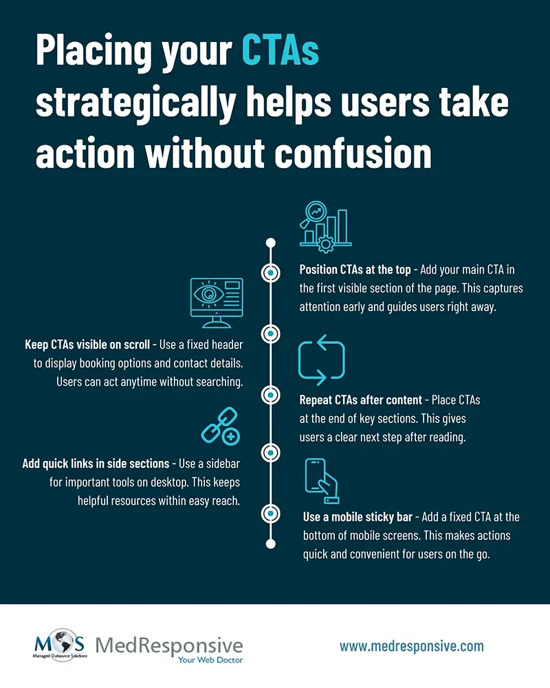
Where to Place CTAs on a Healthcare Website for Better Results?
The success of your digital strategy depends heavily on where and how your CTAs are placed. If your goal is to increase bookings, your CTA must be easy to find and accessible on every page.
One effective approach is to keep your main CTA visible at all times, such as placing a “Book Appointment” button in a fixed header. This ensures users can take action instantly, no matter where they are on the page.
It’s also important to place CTAs within relevant sections of your content. Adding them after key information or service details helps users take the next step naturally, making the overall journey smoother and more intuitive.
Some CTA Design Tips
The design of your CTA buttons is just as important as the wording. Buttons should clearly look interactive through the use of contrast, shape, and color. If a CTA blends into the background, users may not notice it or take action.
Using the right colors helps draw attention. While your overall design may use calm tones, CTA buttons should stand out with a contrasting accent color. This makes the action easy to spot without feeling too aggressive, guiding users naturally toward the next step. Here are some tips to design CTAs:
- Use high-contrast colors– Choose a button color that stands out from your site. This makes the CTA easy to spot.
- Use rounded corners– Slightly rounded edges feel more inviting. This improves user comfort.
- Keep design consistent– Use the same CTA style across pages. This builds recognition.
- Add hover feedback– Show a slight change on hover. This signals interactivity.
- Keep surrounding space clean– Avoid clutter near CTAs. This keeps user focus clear.
Optimizing CTAs requires a clear strategy and ongoing testing. Experts analyze user behavior to refine placement and align CTAs with content flow, making actions easier to take. They ensure messaging stays clear and appropriate to build trust, while continuously testing to improve performance. With the right strategy and support from a reliable healthcare SEO agency, you can improve engagement, increase inquiries, and create a better digital experience.
FAQs
- What is a CTA on a healthcare website?
- How many CTAs should a page have?
- What makes a CTA effective in healthcare?
- How can I improve CTA performance?
A CTA is a prompt that guides users to take action. Examples include booking an appointment or contacting a provider.
Focus on one main CTA per page. You can repeat it in different sections for visibility.
Clarity, trust, and simple language make CTAs effective. Users should understand the action immediately.
Test different wording and placements. Track user behavior and adjust based on results.
Turn clicks into patient connections.
Let’s optimize your CTAs to drive more appointments..
Contact Us