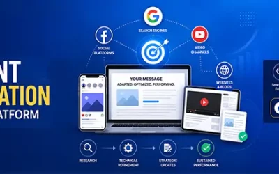
Infographics are powerful visual tools to present data in an easily understandable format. Infographics can play a vital role in digital marketing for healthcare by helping providers present data, especially complex medical information, in an easy-to-understand and visually appealing format.
An infographic combines the best of text images and design to represent complex data, and makes it easy for your target audience to understand and digest what the data is about. An expert provider of medical website design services can design eye-catching, well-organized and informative infographics for your digital marketing campaign.
How infographics benefit Healthcare Marketing
Here are five ways in which infographics can benefit healthcare marketing:
- Patient education: Infographics can be used to educate patients about their health conditions, treatment options, and preventive measures. For example, an infographic on how to improve wellness can highlight the importance of getting vaccinated, regular exercise, a healthy diet, cleanliness and handwashing to reduce risk of bacteria, and so forth. This can lead to more informed patients, and drive better patient engagement and improved health outcomes.
- Brand awareness: Infographics can be used to establish a brand’s expertise and authority in a particular area of healthcare, leading to greater brand recognition and patient trust.
- Improved communication: Infographics can help improve the relationship between the patient and practitioner. They can help healthcare providers communicate important medical information to patients, caregivers, and other stakeholders in a clear and concise manner, leading to better care coordination and improved patient outcomes. Improving people’s ability to grasp health information can enhance their medical decision-making capabilities.
- Increased shareability: Infographics are highly shareable on social media platforms, allowing healthcare providers to reach a wider audience and potentially go viral, leading to greater brand exposure and patient engagement.
- Research communication: Infographics can be used to communicate research findings and medical breakthroughs to a wider audience, leading to greater public awareness and support for scientific research.
Digital marketing experts can turn an informative article or blog post into a bold and eye-catching infographic. They can create graphical representations of the content that includes clear, concise, and accurate information and visually appealing design and layout, making it an effective tool for communicating complex ideas and data.
Different Types of Infographs for Healthcare
There are different types of infographics to choose from based on your objectives and the information type you are presenting:
- Statistical: This is the best infographic that you can use to back up an argument with relevant data, or to present survey results, or data from more than one source. A statistical infographic focuses on your data and its layout, and features visuals to help to tell you tell story behind that particular data. This type of infographic can include:
- Charts
- Images
- Icons
- Eye-catching fonts
 Image source: https://visme.co/blog/wp-content/uploads/2015/11/1.-Statistical.jpg
The above demographics report includes pie charts, pictograms, map, and a bar graph. This mixture of graphs and charts is suitable when you want to present various facts and figures so that the information is best communicated to your audience.
-
- Timeline: Timeline infographic templates are used to visualize the history of a trend, company, or product to highlight important dates or to give an overview of events. It helps to increase audience engagement with your brand and also produce leads. It can be designed in a vertical, horizontal, or winding format according to the space available and the type of information that you will display. This infographic helps create a clearer picture of a timeframe and is easy for the customers to follow each event and its corresponding date through it.
- Informational: This infographic contains more text than other infographic types. It is used to explain concepts or topics with the help of visuals. It builds credibility as it lets you show your expertise and also educate audience. An informational infographic is separated into different sections with descriptive headings. When you number each section, it helps in the flow of infographic design. Moreover, it is found that people like infographics with numbers in the title. So, with descriptive headings and illustrative icons you can make communication easier.

-
- Image Source: https://venngage-wordpress.s3.amazonaws.com/uploads/2016/11/image17.png
- Comparison: This infographic type is used to compare two products, ideas, people, events, places, and things. Apart from that, you can use it to visually compare and contrast seemingly opposing things to show the differences, similarities, and relative advantage. You should choose this infographic if you want to help your audience choose a service between two options, or to show the benefits of one over the other. It can help speed up the decision-making process and lead to more conversions.
- Process: Easy-to-understand process infographic templates can be used to provide a summary or overview of the steps in a process. It simplifies and clarifies each step to make it easy to understand. It follows a straightforward left-to-right or top-to-bottom flow.
- Map infographic: Map infographics can be a powerful tool for healthcare providers to visualize and analyze data, track disease outbreaks, identify disparities, and plan interventions. For instance, in the event of infectious diseases like influenza and COVID-19, maps can be useful track the spread of diseases, allowing healthcare providers to monitor the situation in real-time and respond quickly.
- Hierarchical: Hierarchical infographics organize information according to certain levels like the importance level, income level, difficulty level, etc. Most commonly, you can see it in pyramid shape or in the organizational chart form. This type of infographic compares different levels and shows how they are related to each other.
- How-to: It explains how to achieve a specific outcome and demonstrates the steps to do so. If your purpose is to teach your audience to act or about using a product, using this will be a good option. When people find something easy to understand, especially if it helps them learn something helpful, it is very likely to be shared. So, a how-to infographic will most probably reach a larger audience.
- Anatomical: This infographic breaks down information about a particular topic, or tells the audience how a service or tool works. The example shown below given in visme.co, is the anatomical infographic type that uses visual metaphors like the human body to show information. The infographic shown below displays the anatomy of a person who works as an information designer.

- ImageSource:https://visme.co/blog/wp-content/uploads/2020/05/WhatIsInformationDesignAndWhyIsItImportant-315×500.jpg
- Interactive: This type of infographic lets the audience decide how they can explore each section of the content. They can do it by dragging elements or clicking it, zooming in, and choosing answers to questions. You can use an interactive infographic if your aim is to increase the time your target audience spends with your content. Interactive infographics are captivating and inspire the audience to stay longer, encouraging them to explore and understand the details presented.
Infographics may contain multiple data visualizations such as charts, graphs, maps, and diagrams, to help communicate complex information in a clear and visually appealing way. Healthcare digital marketing experts can provide attractive infographics that combine color, graphics, and data and ensure clear communication of the medical information. They can provide visualizations that are easy to read and understand and complement your blog post. They can also optimize your infographics for SEO by incorporating relevant keywords and backlinks, leading to improved search engine rankings and greater visibility for your healthcare practice.
Take the first step towards achieving your online marketing goals with our organic SEO services.
Talk to us at (800) 941-5527!