
The significant digital evolution has made it important for businesses in all sectors to move with the growing trend and take adequate steps to ensure that their website is responsive. The responsiveness of a website is an important factor when it comes to improving user experience and avoiding common SEO pitfalls that can hinder the Google rankings. With increase in mobile internet accessibility and usability year-on-year, it has become vital that websites meet user expectations for a smooth and relevant experience. In simple terms, a responsive website is one that is able to adapt to different devices that people use to access the internet. This means that no matter what device a person uses – whether it’s a laptop, a tablet or a Smartphone — they will be able to view the website with maximum clarity and comfort. Professional website development services can ensure that a website is mobile responsive, provides a good user experience, and offers easy navigation for visitors.
A well-designed website is one that is both aesthetically pleasing and easy to use. Up to 90% of all websites, or 1.71 billion, have adopted responsive design, according to an August 2024 article from Hostinger. Mobile consumers spend 15% more time on responsive websites, increasing conversion rates by 11%. Responsive websites see more unique clicks, longer sessions, and higher search engine optimization (SEO) ranks. It is reported that 79% of visitors abandon websites with poor usability, such as confusing navigation or cluttered layouts. The importance of responsive design for user retention is highlighted by the fact that 88% of users who have a satisfying browsing experience are likely to return. Furthermore, according to 53.8% of website designers, one of the main reasons for redesigning a website is the absence of responsive web design across all screen sizes.
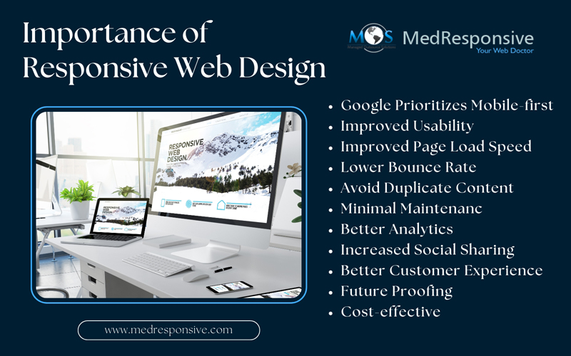
Relevance of a Responsive Website Design
Typically, a responsive web design (RWD) involves creating web pages that perform well across a variety of devices and screen sizes. This helps web designers create a unique website experience that accommodates the many different ways users access and interact with websites. According to reports, mobile traffic accounts for nearly half of all web traffic, globally. This signifies the increasing need for website owners to have websites that are accessible and easy to navigate, even on a small screen (such as a tablet or smartphone). Despite the slew of published statistics that ranks responsiveness as a key factor in enhancing user experience, many website owners have been quite slow to adopt a responsive web design. Here discussed are some of the key benefits or reasons that make responsive website design a high priority in SEO.
- Google Prioritizes Mobile-first – In recent years, Google has moved towards a “mobile-first” approach. With more users searching from mobile devices than ever before, it has become increasingly important for websites to be easily accessible on any device. Google aims to provide valuable and accessible content to users. The Google algorithm is most inclined to rank a site that fits the bill – by being responsive and user-friendly. Google favors those websites that are fully optimized for mobile devices and have adopted a mobile responsive web design.
- Improved Usability – Time on Page can be considered an important signal whether the content given in the website matches with the specific terms that users use for searching. This single factor determines whether the users have had a positive experience while visiting a website. The reasoning is that if a user is unsatisfied by the website content (or in this case – the website experience), then the chances are quite low that they will stick around. A responsive website will adjust to the screen size of the device it’s being viewed on and makes it faster, more accessible, and easier to navigate. This is important as it ensures that your website is always easy to use, no matter what device your visitors are using. It also makes it easier for users to find the information they are searching for and typically encourages them to stay on your site for a longer time. In addition, improved usability may also encourage users to come back to your website in the future and turn into paying customers or subscribers.
-
- Improved Page Load Speed – Page load speed is another factor that greatly impacts your SEO rankings. Starting with Google Speed Update, back in 2018, Google uses mobile site speed as a ranking factor in mobile search. In fact, Google’s updates are aligned to user behavior. An increase in mobile device use means a paradigm shift for how Google bots crawl, index, and display results in the SERP to satisfy people’s needs thereby promoting customer satisfaction. In a mobile-centric world, having a responsive design is a fundamental part of a successful SEO strategy. How quickly a website loads can make or break a user’s experience with a website. Responsive web design will help reconsider both the layout and the content of a website to provide a smooth user experience from desktop, to laptop, tablet, and smartphone without any inconsistencies. Optimizing the page load speed speed can help gain more traffic and conversions on a website. If you fail to do so, the SEO efforts would be compromised, resulting in a drop in the traffic.
- Lower Bounce Rate – Typically, bounce rate reflects the percentage of users landing on a page and deciding to leave before continuing the website journey. This metric can be an indication of whether a website satisfies the user’s search. Google considers this factor for evaluating the relevancy of a web page for a given search query. A high bounce rate provides a signal related to a drop in the ranking, reflecting thin or irrelevant content, or a poorly designed website, just by looking at user interaction. It may also hint that a website didn’t load quickly or provide the positive experience users were looking for. In some cases, the content may be fantastic, but if the web design makes it difficult for users to navigate the site, users will drop off and look for information elsewhere.
- Avoid Duplicate Content – Paying attention to a website’s content and overall UX is an important factor to consider when prioritizing the responsiveness of a website. Even though a responsive web design is not necessarily the mechanism by which Duplicate Content is prevented, it can often help identify this common pitfall. For instance, when building or redesigning a website, you could accidentally create two versions of a website (one mobile and one desktop) – which in turn can lead to duplicate content issues. Even though the two URLs may be different, the content may often be the same, and this can confuse Google as to what content to prioritize. Due to the duplicate nature of the content, Google bots cannot tell which version should be indexed, whether one version should absorb all link metrics, or be kept separate. A responsive web design emphasizes the creation of a single, mobile-responsive version of a website. This can help resolve URL duplication issues across two versions of the site. It can also help adapt the layout and content to fit any screen size while offering a consistent user experience.
- Minimal Maintenance– Many companies, especially smaller ones, struggle to find the time to redesign or regularly update their websites. However, with responsive design, you can quickly and easily make necessary modifications yourself, without needing to hire a designer for every aspect. Managing other parts of your marketing also becomes simpler when you have a single, unified website. You’ll no longer need to worry about whether redirect links are effectively guiding the right visitors to the right page or whether to link to the desktop or mobile site in social media updates. Responsive design significantly reduces the stress of website management by streamlining and unifying the experience across devices.
- Better Analytics– With responsive design, you can monitor your website’s performance on all devices. It enables you to gather and examine data from various platforms, screen sizes, and orientations, yielding insightful information about user behavior. You can make data-driven decisions to enhance user experience and increase conversions by understanding how visitors engage with your website.
- Increased Social Sharing – Many designers build sites with social sharing capabilities in mind to make it easy for users to share the content far and wide. Even though social media is not an important ranking factor, that doesn’t make it less important when it comes to designing an overall marketing strategy. Social media plays an important role in an SEO campaign, complementing each other, and helping leverage website traffic. A responsive web design makes content sharing possible across all social platforms, with your peers, and on their social media profiles thereby expanding the target audience groups. More social traffic means more users visiting a website, which could mean even more customers or subscribers for the business. With easy-to-use social share buttons, the mobile-ready site will encourage users to share content across a much wider audience group.
- Better Customer Experience – Google focuses on publishing content that they are most interested in. Creating a user-focused experience will help higher rankings in the search results. A responsive web design helps in creating a positive experience for users. Highly satisfied users are more likely to turn into subscribers or leads.
- Future Proofing– Responsive design is a progressive strategy that can help future-proof your website. No matter what new technology is developed in the future, responsive design makes sure that your website is usable and accessible for users by adjusting to different screen sizes and devices. Additionally, it guarantees that your website will continue to be competitive and relevant in the ever-changing digital landscape.
- Cost-effective– The affordability of responsive web design is yet another important benefit. Responsive design enables you to manage a single website that adjusts to all screens, eliminating the need to develop and maintain distinct versions of a website for various devices. This is a smart investment for any company or organization, saving not only money but also time and effort.
Thousands of websites are using responsive web design to improve their search engine optimization. Here are two top instances:
- Moz: After implementing a responsive web design, Moz, a top provider of SEO software, experienced a 25.59% rise in search engine ranks and organic traffic.
- Active Web Group: Digital marketing company Active Web Group observed a 185% rise in new users following the implementation of responsive site design.
Designing a responsive website can be challenging as businesses often have a large amount of information to present on their website, and struggle to do so in a way that does not confuse or overwhelm their visitors. As more and more people tend to use mobile devices to access the internet, it is important that businesses have responsive websites.
Responsive design can help improve a website’s search engine optimization since Google now penalizes websites that are not mobile-friendly. Website development services provided by a reliable organic SEO company can help create an aesthetically appealing design with unique content that will increase the website’s search engine rankings and improve online visibility.