
Mobile search engine optimization vital for promoting a webpage in the present scenario. The shift of users to smartphones and tablets has led Google to consider mobile friendliness a top criterion for ranking. Professional SEO services handle the intricacy of a device-friendly web page design, allowing the flow of more users and ROI.
The task of zooming or pinching a page to go through the contents creates distress in the users, persuading them to prefer more navigable and user-friendly competitive websites. Information must be effortlessly available to users on all devices. A combined version of all device-friendly features will make your website more authoritative.
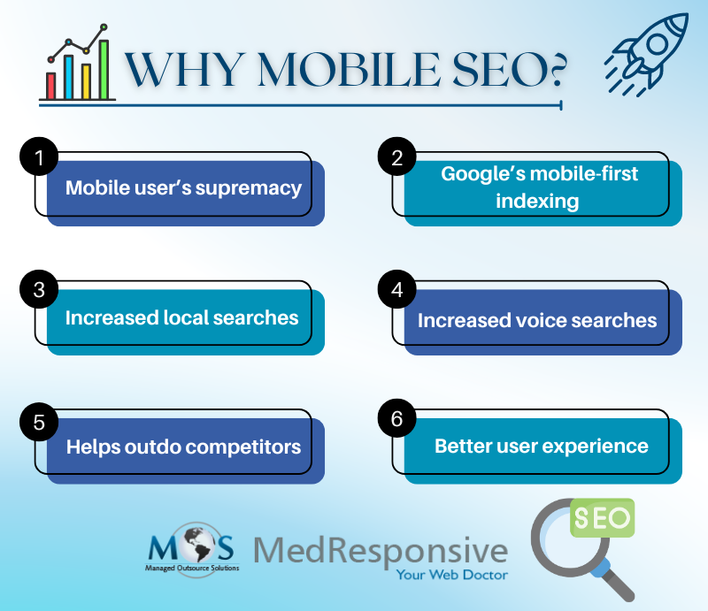
6 Reasons to Consider Mobile SEO
- Mobile user’s supremacy
The supremacy of smartphone and tablet users over desktop users has forced websites to adapt to device-friendly interfaces. Along with an increase in online shoppers, a majority of in-store shoppers now surf in their phones to research about a product.
- Google’s mobile-first indexing
Mobile responsiveness is the new ranking factor of major search engines. Google now uses mobile-first indexing, i.e. the website’s mobile version for ranking and indexing.
- Facilitates local searches
Local businesses can prosper with device optimization due to the user reliability factor. It helps in establishing faster connections with the targeted local audience.
- Enables voice searches
People find voice search more convenient due to its inclusivity. Aligning the website with voice search conditions would improve visibility.
- Helps outdo competitors
Quick adapting to the everchanging search engine algorithms helps to stay ahead of the competitors.
- Improved user experience
Apart from the visibility aspect, mobile SEO improves the user experience, making it their first choice, contributing to higher engagement.
How to Boost Mobile Search Engine Optimization
Now that we know about the benefits, let us look into the ways to improve mobile search engine optimization.
- Boosting website speed
Due to the slow speed of mobile networks, websites are supposed to reduce their load time to prevent the risk of losing customers. This can be achieved by avoiding surplus graphic elements and leveraging browser caching. HTTP requests should be reduced by minimizing the number of page elements. Most importantly, use compressed videos and images in the right device-friendly formats. Make necessary modifications after a thorough analysis on page speed online checkers.
- Create a responsive design
A responsive design is a shortcut for Google to recognize the device-friendly nature of a website. Choose one that adapts to different resolutions, fitting on both desktops and mobiles. Fluid grids shall be utilized to adjust layout and other elements according to the device type. Reduce the reading strain by including enough white space.
- Keep only minimum pop-ups
Pop-ups and interstitials may result in a negative user experience on smartphones and tablets. Stop or reduce their usage and replace with banners or information bars in order to keep the traffic alive.
- Mobile-friendly content
Too many long sentences would make the content less understandable, leaving very few users relying on it. Split sentences for readability and discuss the most appealing points at the top. Eliminate unnecessary words and highlight the important phrases.
- Enhance user experience
Enhance the user experience and accessibility by simpler navigations and easily clickable touch elements. The right placement of call to action converts user satisfaction to ROI.
- Mobile-responsive URLs
Clear, concise URLs pave for customization and proper distinction. Employ ‘M configuration’ or separate URLs for desktops and mobile versions for effective redirection, based on the device in use. Avoid complexity by shortening the URL length.
- Optimization of title tags and meta descriptions
Optimize each page with a short yet unique title. Target a single main keyword in the title and avoid keyword stuffing in the Meta description. Keep the title tag between 50-60 characters and meta description under 120. Use third party websites to analyze the right count.
- Local optimization
Small businesses must utilize the opportunity to gain more visibility and customers by using geo targeted keywords. Use tools like Google My Business to boost local SERP.
- Voice search optimization
Voice SERP can be achieved by using voice search friendly keywords. Style the content using natural language and conversational queries.
- Regular analysis and updates
Keep track of mobile SEO trends, change in algorithms and standards to make changes in the strategies. Outdated styles and trends would be of advantage to competitor sites. Use analytical tools for monitoring performance updates and user behaviour to bring in improvements. Use ‘Google’s Mobile-Friendly Test’ for regular analysis of the website’s mobile friendliness.
- Proper sitemap
Submission of device-friendly sitemaps would favor indexing and rankings. Sitemaps must be created for both mobile and desktop versions.
- App indexing
Businesses incorporating apps could use app indexing for better search visibility. One way to achieve this is by creating deep links to specific contents of the app by adding intent filters.
- Reducing redirects
This is a tactic to reduce load time. Redirects could slow the website and hence must be avoided for better user experience.
- Page resources must not be blocked
Ensure that the page resources are not blocked for better content accessibility. Make sure that Googlebot sees the site’s JavaScript, images and CSS.
Mobile SEO is the most effective way to improve a website’s rankings prioritizing user satisfaction. Professional SEO services help achieve this by employing organic SEO methods, while reducing the user constraints and improving the company’s ROI.
Secure better rankings with device-friendly websites!