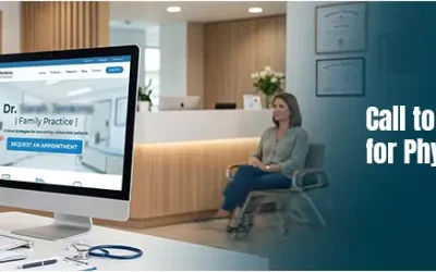
The visual design of a healthcare website is very important because that is the first thing that grabs the attention of your targeted audience. This makes healthcare website design highly relevant. While search engine and social media optimization are important, you need to start with a great website design because it can have a considerable impact on your conversion rates. Researchers at Stanford University found that 46.1% of people consider a website’s design as the top criteria for deciding whether a company is credible or not. An aesthetically appealing website can help with conversion rate optimization because people naturally gravitate towards something that is beautifully designed.
A well-planned medical website design creates a good first impression among the users and this attracts more users to the website. Web design can have a powerful impact on buyers and their choices. Studies show that product assessment takes about 90 seconds. The first impressions are about 94 percent design related. How can you ensure an attractive website design while also making sure it is fully functional? Here are some important factors to consider.
- Ease of use: Ensure that your website is user friendly and has an appealing layout which makes the user want to engage with the page. It should be easy to navigate so that users can explore and understand the website easily. Choose a simple but intuitive navigation that can make visitors come back for more.
- Simple home page design: This will make the audience comfortable. It is best to offer fewer products/services on your home page with more text explaining a particular topic.
- Color and white space: Often, color is not given due importance in website design but according to designer Tom Kenny, color can play a very important role in usability as well as convey the overall meaning of a brand as well as the overall mood of the website. Choose a color palette of your preference, but there are a few things to consider. It is best not to use more than 5 colors. The ideal number of colors to use is 4. Red and green are the colors that those with color blindness of deficiency struggle with the most. If your target audiences are women then focus on blue, purple and green and for men choose blue, green and black. Do not use brown or orange since these are considered least effective. Health industries could use calming colors and smart use of white space or negative space. Without white space your website would be virtually unreadable. White/negative space is the space between the larger elements on your page (e.g. between your header and your content; between sidebar and content) as well as that between all the smaller elements on the page such as the space between paragraphs, between lines of text, and the space between letters. Smart use of white space ensures that everything on your site is legible, scannable and easy on the eyes. All this will help increase conversions.
- Clear UVP: You should have a unique value proposition (UVP) and your website should communicate this. To arrive at your UVP, you should know which treatments/products/services you excel in and how you stand apart from your competitors. When you have identified your core strengths, you can whet your website’s messaging to reveal your uniqueness. If your UVP is not apparent to your website visitors, make it clear forth right why they should choose your brand. A good value proposition should explain how your product/service can solve a healthcare customer’s problems; what unique benefits the product or service will deliver; and why they should choose you over your competitors. Make sure that you explain your UVP on your landing pages.
- Video content: Videos can dramatically increase conversions. Videos can be incorporated into your home page design to introduce your hospital/healthcare organization before a user starts navigation. You can use videos to show a prospective patient around your facility, introduce your doctors, and highlight your value points. Videos can help showcase your research expertise and innovative treatment approaches. Video testimonials of patients can have a positive impact because they are authentic, more engaging and more powerful than written testimonials.
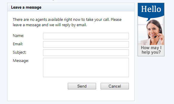
- Virtual chats: People now prefer quick online chats while browsing the website instead of picking up the phone or dealing with an option menu. Live chat tools can be used to address any questions your website visitors may have. Since live chats generate an immediate response, they are much more preferable than a contact form. Live chat tools can also be used to gather email addresses.
- Headlines: The headline should be such that it should address any concern related to your potential customers or patients. Headlines should be creative, bold and captivating. Consider using bold fonts and ensure that your headline is persuasive.
- Stick to minimum information from customers: Customers may not want to give you their city, state, last name or any other information in exchange for a free download, so keep it short. Start with minimum details like name, email and zip code. If you are using a captcha test, you could try turning it off and see if there is a difference in response rate. However, when you turn off the captcha test, it shouldn’t increase your spam.
- Free offers: Providing free offers helps to attract more targeted audience to your website. Clearly explain howyou can meet the needs of potential patients and address their concerns.
- Trust symbols or badges: Badges as design elements can boost your credibility. Badges from Yelp and PayPal’s certification logo are two examples of trust symbols. You may also have a security seal or any other industry related symbol to share. For example, badges provided by McAfee prove that you have an encrypted link between your website and your visitor’s browser. It means that all information sent through your landing page forms is secure.Testimonials from customers also serve to establish your good reputation and credibility.
Perform A/B Testing
A/B testing helps you to find out what works best for your website. Here is what you can test.
- Change the text in your call to action buttons and see if there is a change in response rates. You could also try changing the color of the call to action buttons.
- Test different headlines on your landing pages that experience heavy traffic. You could see a dramatic increase in traffic and conversion rate by testing out different headlines.
- Replace stock images across your website with photos of your business or employees.
When testing, make only one change at a time. Study your website traffic, wait for a few weeks before analyzing the data and deciding whether to make that change permanent or retain the earlier layout.

Users judge websites within a few seconds of arriving on the website. So make sure that your website is not confusing or cluttered. Healthcare website design requires more creative thinking and innovation. Only such an approach can ensure a fresh and dynamic website that can attract the targeted consumers. Color, attractive typography, and smart use of white space can make a website alive, vibrant and unique. To ensure a healthcare website that conveys your professionalism and state-of-the-art technology, consider partnering with a Long Island SEO company that offers dedicated website design services. Apart from implementing the necessary changes, they will constantly evaluate your website’s performance and work towards increasing your leads and conversions.