Over the past few years, “responsive design,” “mobile-friendly,” and “mobile-optimized” are phrases we’ve all heard frequently. Why? Because, everywhere you look – be it a subway, at work, at school, at hospitals, literally everywhere – you can see people on their smartphones. The little device in our hands has radically altered the way we work, socialize, organize, and entertain ourselves. From providing information about your firm and its practice areas to driving prospective clients to take the desired action, a dynamic desktop website lays the foundation for all business connections with your clients. If it’s not mobile-friendly, you’re missing out on an important part of your online presence. A reliable search engine optimization company would craft efficient mobile-friendly content that can help you stand out from competitors and deliver a better user experience.
What Is Mobile-friendly Content and Why Is It Important?
Being in the age of mobile internet, we witness that mobile traffic is increasing rapidly, making it crucial for your content to be “mobile-friendly.” This means that your website content efficiently works on a mobile device like a phone or tablet and is shrunk to adjust on the smartphone’s small screen.
Mobile-friendly content engages and converts customers and moreover, provides an ideal experience for your customers by enhancing your user’s experience and improving your SEO efforts. Based on how optimized your site can be for mobile devices, website rank, conversion rate and customer satisfaction will also gradually improve.
However, despite the widespread use of mobile devices, many businesses haven’t yet optimized their online content writing and design for mobile success. A professional SEO company can provide content writing services that can help you reach and connect with the mobile audience and prospects in different ways.
Here are 6 actionable tips for crafting content that is easy to read and follow on your mobile devices:
Tips for Crafting Actionable Mobile-friendly Content
- Structure Mobile Content Differently from Desktop Content:
While crafting content for mobile devices, make sure to craft it differently from desktop content, because mobile phones are much smaller than their desktop counterparts and have only less available space to convey your message. So, our first priority should be presenting the initial and important information to a mobile visitor. The information should hook the readers and leave them wanting more.
For developing such content, follow certain tips:
- Write a compelling headline and follow it up with some powerful content.
- Keep your title short and concise so that it displays on one line in mobile search results.
- Craft strong introductions, get to the point and avoid unnecessary information.
- The first few lines of text should be concise and attention-grabbing.
- Avoid the use of complex words in the content. Instead, use simple words and replace them with wordy phrases. Some examples are:
- A majority of – most
- In an effort/in order to – to
- In the event that – if
- According to our data – we find
- discontinue – stop
- eliminate – drop
- validate – confirm
- witnessed – saw
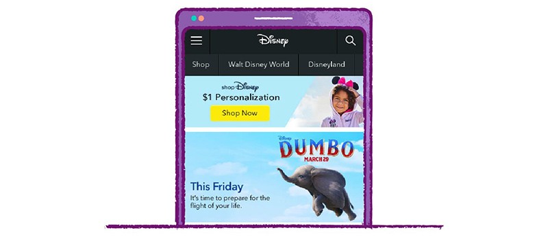
- If you opt for an image-first approach, make it colorful, engaging, and relevant to the rest of the content.
- Keep your paragraphs short so that there are no more than five lines of text. This helps to grab a reader’s attention because breaking content into short paragraphs eliminates the need to scroll to consume more of the content (that is, follow Jon Ziomek’s 1-2-3-4-5 approach).
- Make use of bullet points/lists, subheaders and plenty of whitespace in your mobile content.
- Avoid redundancy, that is, using similar words or phrases that describe the same concept.
- Add images in between your text (about every 300-400 words).
- Don’t use light color shades for your text on a white background, instead use dark type. This helps readers see the words and letters without any straining.
- A font size of at least 12 points is the best choice.
The ideal mobile content will be as interesting and engaging as desktop content. Compared to desktop content, mobile content will be displayed in a more easily consumable and attractive format.
- Highlight the Summary or Key Takeaways from the Content:
We know that mobile users’ attention is often limited and they may not want to read the entire story to get the desired information. They prefer pertinent information to be displayed right away, so it is ideal to highlight the summary or key takeaways from the content.
- This approach of highlighting content not only helps readers to get the information they want, but also helps get you links and social shares.
- Add Images/Videos:
To make your content more easily digestible, add relevant images or videos, and break up your text.
Using images or videos in between text enhances reading on a mobile device, adds visual appeal to content and most importantly, gives you more opportunities to show up in rich search results. Search engine journal points out that, “a research shows visuals are processed up to 600 times faster than text, which means you can help your readers better understand your content through visuals as opposed to solely text”.
- Place CTAs Strategically:
Place the Call to Action (CTA) at the beginning of your content as it helps to encourage people to take some actions on your website and bring you profit.
If you fail to provide them a CTA within a few seconds of browsing your site, you may miss out on conversion opportunities. Therefore, while crafting your mobile-friendly content, make sure your CTAs are prominent and clear on all devices, because you have limited opportunity to capture your readers’ attention.
- Optimize Your Mobile Content:
To stay on top of the fundamentals, ensure that the meta descriptions, page titles, headlines, text and images in your mobile content are all SEO-friendly.
- Preview on a Mobile Device before You Publish:
One of the best readability test practices of mobile-friendly content is its mobile preview. Before publishing your content to mobile devices, always preview your content on your mobile – same as we check how our content will appear on a desktop – and make sure that it is readable to the phone users. With this practice, you can correct mistakes if there are any before publishing – mistakes can lead your visitors to view your brand as less credible and authoritative – and you will also be able to see if your text is easy to understand. If you notice that your paragraphs appear too long, you can break them further, add more subheadings and images or see where more whitespace should be added and so on.
All the above-mentioned tips are useful not only for mobile device users but also for desktop users. When making your site mobile-friendly, don’t settle for a responsive site alone. A responsive site doesn’t mean that it is reader-friendly. To make it reader-friendly, you need to craft mobile-friendly content for your responsive site. This can be done by a few simple tweaks to your writing and formatting, and can dramatically improve your content’s mobile-readability while making the website more attractive for today’s modern mobile user. Businesses can always rely on a professional organic SEO company that could help implement the right strategies to develop mobile-friendly content and enhance their website’s visibility to the right audience group.


